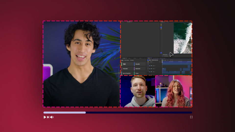

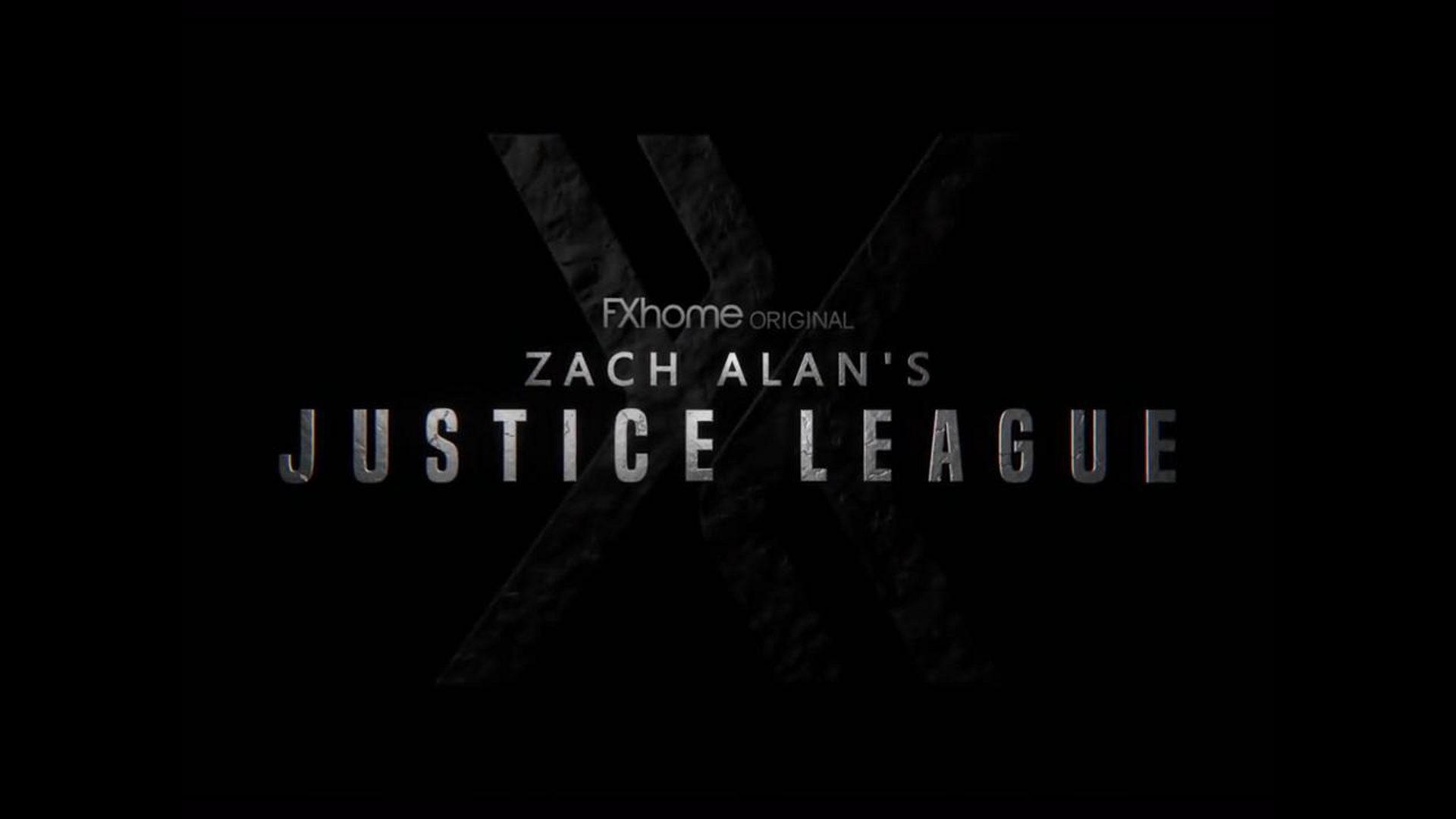
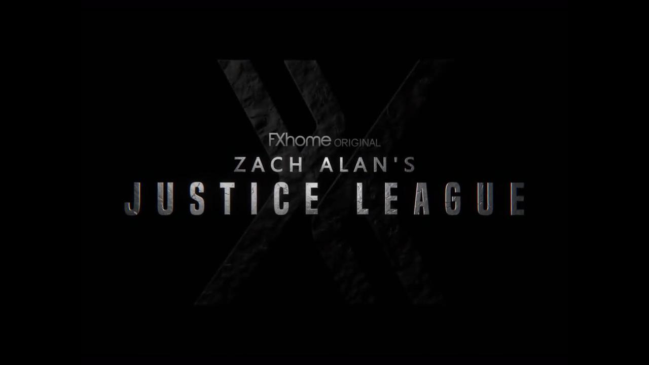
First impressions count for a lot. In this tutorial, we’ll show you how to wow your audience with an epic cinematic title sequence inspired by Zack Snyder’s Justice League. Follow along for free in HitFilm or take it to the next level by subscribing to the Pro tier.
Step 1: Text animation
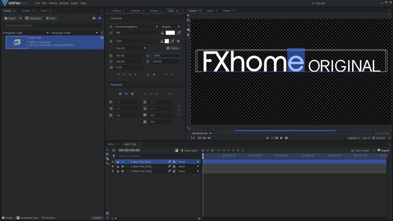
One of the most important aspects of an epic title sequence is having the correct font – We used the “Build Titling” font from Dafont.com. Once you have downloaded and installed the fonts, open up a new Composite Shot in HitFilm. Then, add a new Text layer and begin to type out your text, ensuring that you make each line its own layer. For the line reading “Justice League” we used the Built Titling font, setting the text size to 450, the boldness to SemiBold, and the spacing to 300%. Ebrima was the font used for “Zach Alan”, and the final Text layer (“FXhome Original”) consists of two fonts; Rounded Elegance and Gravity. We enlarged the size of “FXhome”, then reduced the letter-spacing – you can select individual letters and adjust the spacing if needed.
After creating the text layers, select each layer and make them into their own Composite Shot; this ensures that the Surface Studio effect is applied before the layers are Transformed. Lastly, import your logo image, and make it into its own Composite Shot; then, add a Fill Color effect to make your logo solid white.
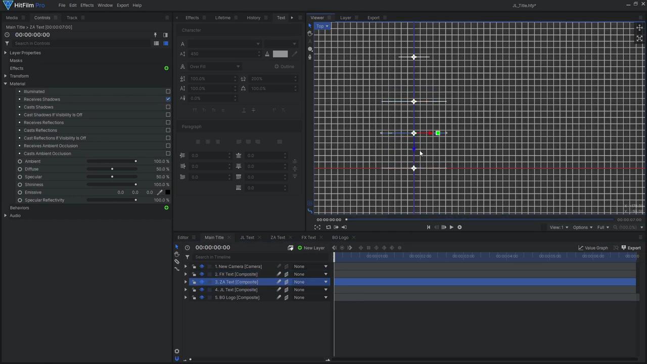
With these layers created, we can now position them correctly:
- Select all the layers and make them 3D, adding in a 3D camera.
- Make sure to disable Illumination for these 3D layers, as the Surface Studio effect will handle the lighting later on.
- Go into top view, then position the logo far back by adjusting the Z position.
- Then, between the logo and camera, place each line of text at a different distance to the camera to create a parallax effect.
- Then adjust the Y position to place them vertically.
- As it’s difficult to tell whether the text is centered, create a new Plane Layer, and add the Grid effect. In the Preset drop-down, choose Title Safe Boundaries – this is a quick and easy way to see if your title is centered the way you want and isn’t too close to the frame’s edge.
- Now that your layers are positioned correctly, animate the camera to zoom in gradually. To do so:
- Jump to the last frame of the shot and enable keyframing for the camera’s position,
- Then, jump back to the first frame, move the camera backward in Z-space.
To reveal the different layers over time, we can use HitFilm’s built-in Linear Wipe animation effect. Adjust the Reveal Length, Gradient Size, and Angle to create your transition. Copy this effect onto the other layers, then slide each layer along the timeline so they fade in one after the other.
Step 2: Add texture to the text
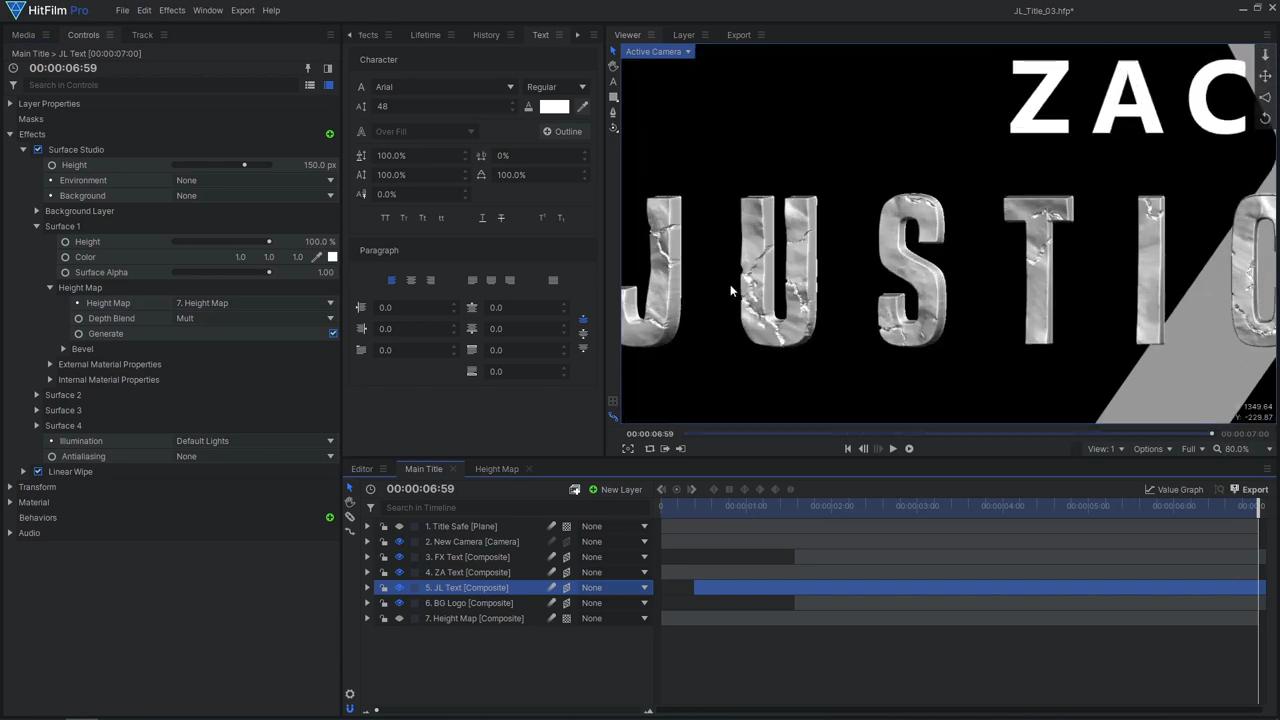
Now that our basic animation is in place, we can move on to adding more detail. We used the Surface Studio effect exclusive to HitFilm Pro. If you are using Express, here’s a tutorial on how to use the Parallax effect to achieve a similar result: https://youtu.be/XN6HlYBXncI. Ensure that the Surface effect is applied before the Linear Wipe. Once applied, reduce the Bevel Size. Surface Studio truly shines when you provide it with a Height Map. You can create one in a new Composite Shot by applying a Fractal Noise effect to a Plane layer. Drag this Height Map composite shot back into the main composite shot and hide it, then select it as the Surface 1 Height Map. Now your text should begin to look like rock.
There are many settings to play with in the Fractal Noise effect to customize your Height Map – we used multiple effects, each with a different noise Type and scale. Set the second effect’s Blend Mode to Multiply to combine with the previous noise effect, then adjust the second effect’s influence by changing the Opacity. If you want to adjust your Height Map while viewing its effect in the main composite shot, click the Pin icon, so your Controls panel doesn’t change when you switch back to the other comp.
To enhance the rocky surface with cracking details, back in your Height Map composite shot, drag in another Plane layer to which you’ll add the Lightning and Electricity effect. Move the Start and End points to opposite sides of the frame. Remove the glow, then set the Animation Speed to 0. Increase the number of Trunks as well as the End Width. To apply these cracks to your Fractal Noise, add an Invert effect, then set the layer’s Blend Mode to Multiply. To prevent these cracks from appearing everywhere on your logo, you’ll need to use another Fractal Noise to control where the Lightning effect is visible. Place the Fractal effect before the Invert and set the blend to Multiply. Then, adjust the Scale, Offset, Exposure, and Seed. You can also adjust the number of Trunks, Seed, and Start and End Width of the Lightning effect. Now that the Height Map is complete, adjust the surface Height to your preference.
Step 3: Add Lighting
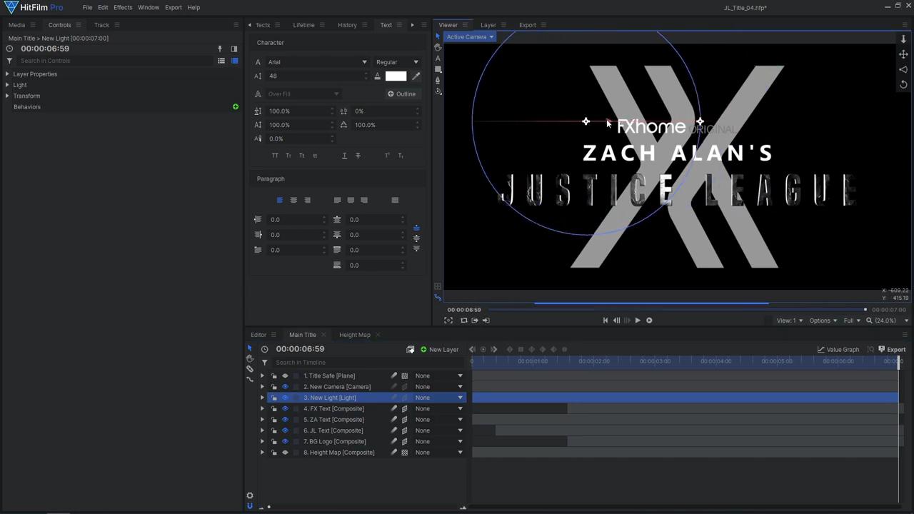
Surface Studio comes with some built-in Default Lights, but we want to control the lighting ourselves. Set the Illumination type to Comp Lights, then add a new Light layer. Position the Light where it creates some nice contrast, revealing the detail from our Height Map. You can also adjust the Fall-Off of the Light to make the intensity fade out farther away from the Light source. Duplicate the Light and adjust its Position and Intensity until you are happy with the lightning. There are various Material controls on the Surface Studio effect to change how the Lights interact with the surface – we liked the look of reducing the Diffuse and increasing the Specular. Copy the Surface effect onto the other text layers, and adjust any settings if needed. Then, copy it onto the background logo layer. We made the surface Color much darker on the logo to make the text stand out more. Additionally, we used a separate Height Map for the logo due to its size being much larger than the text. Add a Color Gradient effect to the final text layer, setting the Blend to Multiply. Move the Start and End Points to position the gradient. To finish off the title, we added a new Grade layer and applied Chromatic Aberration, Lens Distort, and Film Grain. These effects add some imperfections to the title, making it feel a little more realistic and less CG.
And that’s how you can create your own Justice League title effect in HitFilm! Don’t forget to check out our other Justice League tutorials, including Cyborg, Superman heat vision, and The Flash. Subscribe to our YouTube channel for more tutorials like this. See you next time!